🧠 AI with Python - 📊 Visualising Classification Boundaries
Posted on: August 14, 2025
Description:
Introduction
Have you ever wondered how a machine learning model decides which side of the fence a data point belongs to? 📊
This “fence” is what we call a classification boundary — an invisible line (or surface, in higher dimensions) that separates one class from another.
Visualizing these boundaries helps us:
- Understand how a model makes predictions
- Spot overfitting or underfitting
- Compare the performance of different models
Today, we’ll use K-Nearest Neighbors (KNN) with Matplotlib to bring these decision boundaries to life.
Step 1 – Understanding the Concept
KNN is a simple yet powerful algorithm. It doesn’t learn a mathematical formula like linear regression; instead, it classifies a new point by looking at its closest neighbors in the training data.
By visualizing the decision boundaries, we can see how the algorithm partitions the feature space into regions belonging to different classes.
Step 2 – Loading the Dataset
We’ll use the Iris dataset, but since we can only visualize in 2D, we’ll take just the first two features: sepal length and sepal width.
from sklearn import datasets

iris = datasets.load_iris()
X = iris.data[:, :2]  # first two features
y = iris.target
This keeps the visualization clean and easy to interpret.
Step 3 – Training the Model
We’ll train a KNN classifier with k=5 neighbors.
from sklearn.neighbors import KNeighborsClassifier

knn = KNeighborsClassifier(n_neighbors=5)
knn.fit(X, y)
Step 4 – Creating a Grid for Visualization
To visualize decision boundaries, we’ll predict the class of every point in a fine grid covering the feature space.
import numpy as np

h = 0.02  # step size in the mesh
x_min, x_max = X[:, 0].min() - 1, X[:, 0].max() + 1
y_min, y_max = X[:, 1].min() - 1, X[:, 1].max() + 1
xx, yy = np.meshgrid(np.arange(x_min, x_max, h),
                     np.arange(y_min, y_max, h))
Step 5 – Predicting & Plotting the Boundaries
We now predict the class for each grid point and use Matplotlib to plot decision regions.
import matplotlib.pyplot as plt

Z = knn.predict(np.c_[xx.ravel(), yy.ravel()])
Z = Z.reshape(xx.shape)

plt.figure(figsize=(8, 6))
plt.contourf(xx, yy, Z, alpha=0.3)
plt.scatter(X[:, 0], X[:, 1], c=y, edgecolor='k', s=50)
plt.xlabel('Sepal length')
plt.ylabel('Sepal width')
plt.title('KNN Classification Boundaries')
plt.show()
Example Output
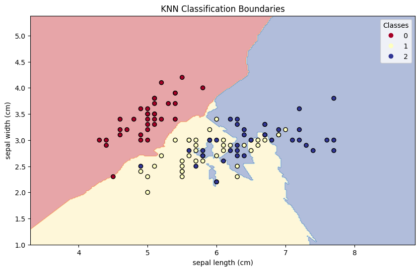
Figure: KNN Classification Boundaries
Interpreting the Visualization
- The colored regions represent areas where the model predicts a specific class.
- The darker dots are actual training points.
- The lines between colors are the decision boundaries — where the model is uncertain and classes meet.
Key Takeaways
- Decision boundaries reveal how a model “thinks”.
- KNN’s regions are often irregular because it’s a non-parametric model.
- Visualization is an excellent tool for debugging & model selection
Code Snippet:
# Import required libraries
import numpy as np
import matplotlib.pyplot as plt
from sklearn.datasets import load_iris
from sklearn.model_selection import train_test_split
from sklearn.neighbors import KNeighborsClassifier


# Load Iris dataset
iris = load_iris()
X = iris.data[:, :2]  # Use only first two features
y = iris.target

# Split into train and test sets
X_train, X_test, y_train, y_test = train_test_split(X, y, random_state=42)


# Create and train the model
model = KNeighborsClassifier(n_neighbors=5)
model.fit(X_train, y_train)


# Define the bounds of the plot
x_min, x_max = X[:, 0].min() - 1, X[:, 0].max() + 1
y_min, y_max = X[:, 1].min() - 1, X[:, 1].max() + 1

# Create a mesh grid
xx, yy = np.meshgrid(
    np.arange(x_min, x_max, 0.02),
    np.arange(y_min, y_max, 0.02)
)

# Flatten grid to pass into model
grid = np.c_[xx.ravel(), yy.ravel()]
Z = model.predict(grid)
Z = Z.reshape(xx.shape)


plt.figure(figsize=(10, 6))

# Plot decision boundary
plt.contourf(xx, yy, Z, alpha=0.4, cmap=plt.cm.RdYlBu)

# Plot training points
scatter = plt.scatter(X_train[:, 0], X_train[:, 1], c=y_train, edgecolor='k', cmap=plt.cm.RdYlBu)
plt.xlabel(iris.feature_names[0])
plt.ylabel(iris.feature_names[1])
plt.title("KNN Classification Boundaries")
plt.legend(*scatter.legend_elements(), title="Classes")
plt.show()Comments
Add Your Comment
Related Posts

🧠 AI with Python – 📊 Reliability Diagrams

🧠 AI with Python – 📈 Model Calibration Curves

🧠 AI with Python – 🔥 Feature Interaction Heatmaps
7-Day AI Crash Course
Learn how AI works, explore real-world examples, and build your first smart models step-by-step.
Perfect for beginners, students, and tech enthusiasts ready to start their AI journey.
No comments yet. Be the first to comment!