⚡ Python Power Shots – 📈 Random Line Chart
Posted on: September 22, 2025
Description:
📌 Introduction
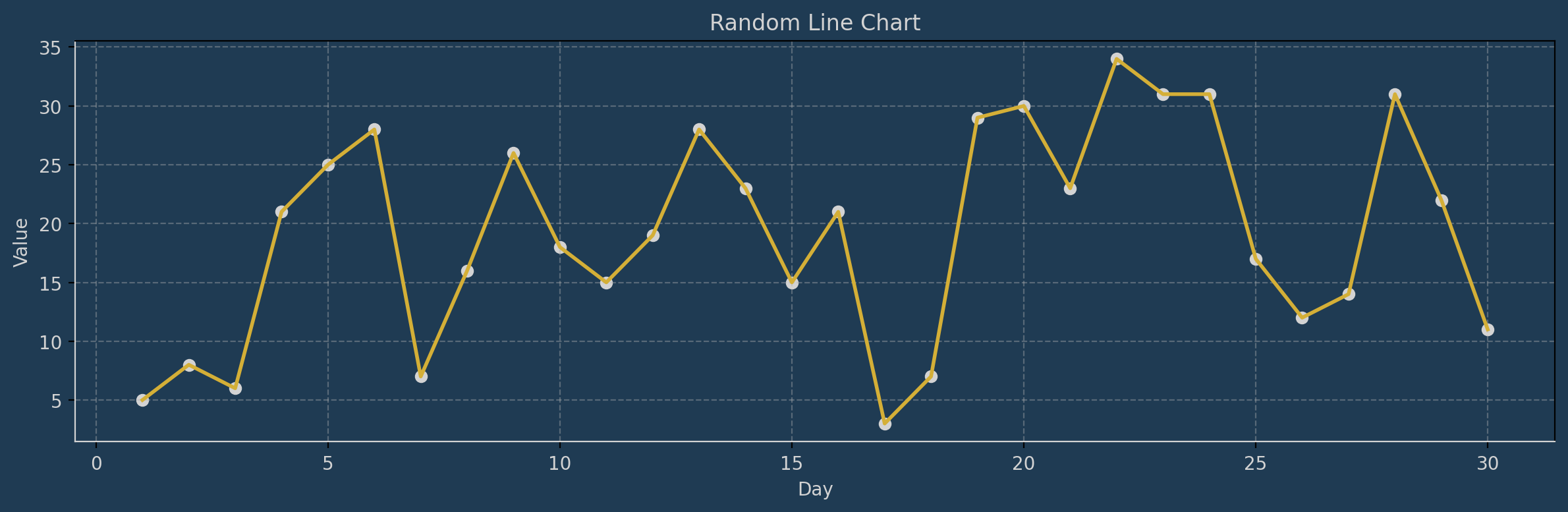
Not all graphs have to look plain and boring. With just a few lines of Python, you can create stylish random line charts that combine clean visuals with custom colors and backgrounds.
This Power Shot shows you how to generate random data, plot it using matplotlib, and add a modern dark theme with golden highlights.
🔎 Explanation
- Use numpy to generate days (x-axis) and random y-values.
- Plot using matplotlib, combining a golden line with gray scatter points.
- Apply a dark background and light grid for contrast.
- Customize ticks, spines, and labels for a professional styled chart.
- Optionally save your figure with plt.savefig() for sharing.
✅ Key Takeaways
- 🎨 Small tweaks in matplotlib can make charts visually engaging.
- 📈 Combining line + scatter makes data points stand out.
- 🌙 Dark themes with gold accents = instant professional touch.
⛳️ Sample Output
Code Snippet:
# Programmer: python_scripts (Abhijith Warrier)

# PYTHON SCRIPT TO GENERATE A RANDOM LINE CHART USING `matplotlib`. 🐍📈🎨

# This script shows how to create a random time-series line chart, style it with custom colors,
# and display data with both lines and markers.
# Perfect for experimenting with visualization and adding flair to your plots.

# Import matplotlib for plotting
import matplotlib.pyplot as plt

# Import numpy for generating random numeric data
import numpy as np

# --- Step 1: Generate sample data ---
# Create an array of days (x-axis) from 1 to 30
days = np.arange(1, 31)

# Generate random integer values between 0 and 35 for each day
values = np.random.randint(0, 35, 30)

# --- Step 2: Create the plot figure ---
# figsize sets the width and height
# facecolor sets the outer background color of the figure
plt.figure(figsize=(12, 4), facecolor="#1f3b53")

# --- Step 3: Plot the line and data points ---
# Plot the line with a golden color and linewidth = 2
plt.plot(days, values, color="#d4af37", linewidth=2)

# Add scatter points on top of the line for clarity
plt.scatter(days, values, color="lightgray")

# --- Step 4: Style the chart background and grid ---
# Set the inner chart background color
plt.gca().set_facecolor("#1f3b53")

# Add a light dashed grid
plt.grid(True, linestyle="--", alpha=0.4)

# --- Step 5: Style axes and ticks ---
plt.xticks(color="lightgray")   # X-axis tick labels in gray
plt.yticks(color="lightgray")   # Y-axis tick labels in gray

# Customize axis spines (borders of the chart area)
plt.gca().spines["bottom"].set_color("lightgray")
plt.gca().spines["left"].set_color("lightgray")

# --- Step 6: Add labels and title ---
plt.xlabel("Day", color="lightgray")
plt.ylabel("Value", color="lightgray")
plt.title("Random Line Chart", color="lightgray")

# --- Step 7: Display the chart ---
plt.tight_layout()
plt.show()

# Optional: Save the chart as an image instead of (or in addition to) showing
# plt.savefig("random_line_chart.png", dpi=200, bbox_inches="tight")
Link copied!
Comments
Add Your Comment
Comment Added!
Related Posts

🧩 Python Automation Recipes – 🖥️ System Health Alert

🧠 Python DeepCuts — 💡 Inside Python’s Memory Allocator (pymalloc)

🧩 Python Automation Recipes – 👀 File Change Detector

7-Day AI Crash Course
Learn how AI works, explore real-world examples, and build your first smart models step-by-step.
Perfect for beginners, students, and tech enthusiasts ready to start their AI journey.
No comments yet. Be the first to comment!